At a glance
- Problem
- Shoppers buying a precision optic mount have to match tube diameter and height, and the store made that hard on a phone.
- My role
- Pitched the audit myself, presented the findings, then built and optimized the prototype with Reptilia’s team.
- Result
- The work is in Reptilia’s staging environment, where the team is testing it before launch.
- Client
- Reptilia
- Role
- UX audit, accessibility review, clickable prototype, and code optimization
- Timeframe
- 2026
- Team
- Self-initiated and pitched; then built with Reptilia’s team, who set the goals
- Disciplines
- UX Audit · Accessibility · E-commerce · AI-Assisted Workflows
- Outcome
- Store chrome 43% → 14% of the phone screen (prototype)
- Client
- Reptilia
- Role
- UX audit, accessibility review, clickable prototype, and code optimization
- Timeframe
- 2026
More details
- Team
- Self-initiated and pitched; then built with Reptilia’s team, who set the goals
- Disciplines
- UX Audit · Accessibility · E-commerce · AI-Assisted Workflows
- Outcome
- Store chrome 43% → 14% of the phone screen (prototype)
Context
Reptilia makes optic mounts and rifle accessories, sold through a WooCommerce store at reptiliacorp.com with about 145 products. Its flagship AUS™ mount is configured by tube diameter, height, and finish, so buying the right one is a fit problem before it is a shopping problem.
I started this audit on my own: I reviewed the live store and an in-progress staging redesign, then pitched the findings to Reptilia. After I presented them, the work became a collaboration: Reptilia’s team set the goals and gave me steady guidance, and I built a clickable storefront prototype to meet them, adding enhancements that pushed those goals further.
The work is now in Reptilia’s staging environment, where the team is testing it before launch. Everything labeled “prototype” below is that work, not the current live site.
Problem
The store sells high-consideration hardware. A shopper who can’t confirm fit either leaves or orders the wrong part, and both cost money. The audit followed that chain from the first screen to checkout.
- Find Fit filters aren’t on the first phone screen; staging search returned no products for “AUS MOUNT 30MM”.
- Fit The Custom Build configurator lives on a separate subdomain, outside the store’s header and cart.
- Trust The staging homepage showed no California shipping notice before checkout.
- Act On staging, Add to cart was an outline button while marketing buttons were solid.
- Access Olive used as text on dark backgrounds measured about 2.8–3.2:1, under the 4.5:1 AA minimum.
Constraints
- No access to Reptilia’s analytics, so findings are expert review backed by measurements, not funnel data.
- The live store runs on WooCommerce. The prototype had to stay portable to that theme, not invent a new platform.
- The staging redesign’s palette and mood were good. The brief was to keep the look and fix readability and task flow.
- No moderated test participants yet, so task success was scored by expert walkthrough against a written task script.
What I did
Set up the audit like a study. I wrote a moderated task script with eight shopper tasks: for example, find an AUS mount for a 34 mm tube at about 1.70 in height, check California shipping before adding to cart, and build an AUS setup without leaving the store. Each finding maps to a shopper task, a written requirement, or a WCAG 2.1 AA success criterion, ranked P0 (blocks a purchase) to P3 (polish).
Ran it on my own AI-assisted harness. The same desk audit ran through four review lenses (UX, visual design, business viability, and inclusive design), then I merged them into one ship order. Layout claims were measured in a headless browser at 390 × 844 so “too tall” became a number. In total that produced more than 25 audit reports across the homepage, listings, product pages, the builder, checkout, and mobile.
Mobile chrome. The first prototype pass copied the desktop header onto the phone: utility links wrapped, Cart dropped to a second line, and three of the four shop categories only appeared on desktop. I replaced it with one compact bar (logo, search, cart, menu) and a full-height menu drawer that traps focus and closes on Escape.
Compact header
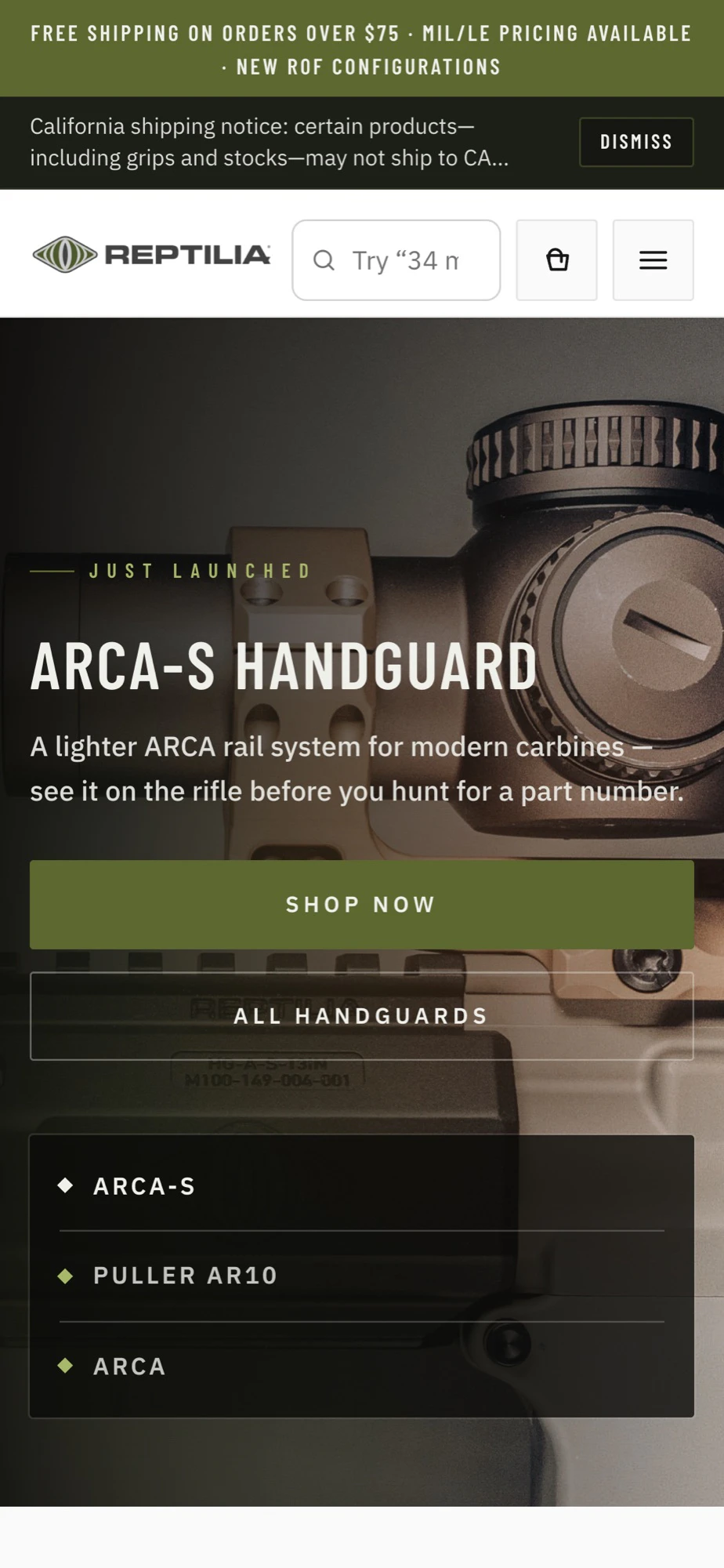
Menu drawer

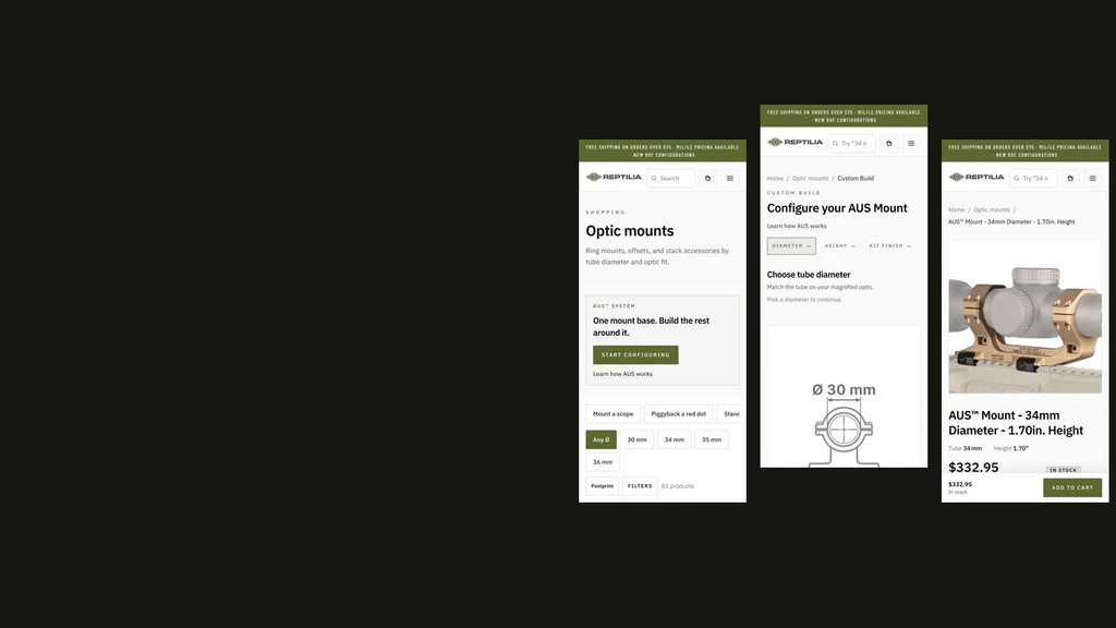
Filters before merchandising. On the live optic-mounts page, the first phone screen shows a category chip, a sort menu, and an unfiltered grid. In the prototype, tube diameter and job chips sit above the product grid, with the AUS builder offered as one clear path rather than a buried text link. A later pass found the AUS promo had pushed the 34 mm chip below the fold (1011 px down an 844 px screen); compacting it brought the chip up to 676 px.
Live site

Prototype

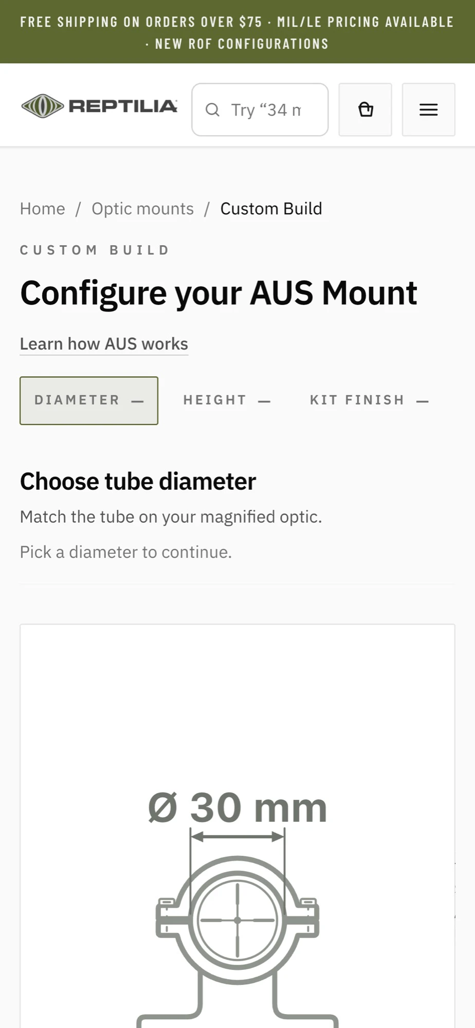
The builder, inside the store. The live Custom Build sits on builder.reptiliacorp.com, away from the store header and cart, and its Step 1 asks for diameter, height, and finish in one long form. The builder audit’s verdict was that the steps were right but the pacing was wrong. The prototype asks one question at a time, collapses each answer into an editable chip, and draws the mount as you choose: tube diameter first, then height, then finish.
Live site

Prototype
Product pages that keep the buy button in reach. In the first prototype pass, Add to cart scrolled away under specs and story on a phone. The prototype adds a sticky Add to Cart bar with a 44 px target, puts fit details next to the price, and adds a short warranty summary beside the install and warranty links.
Live site
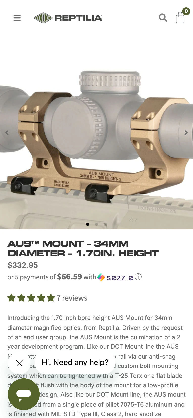
Prototype

A homepage with one job per section. The homepage audit counted about 10 stacked merchandising sections: three selling “new,” two text-only category grids, and two product rails sharing the same products. The recommendation cut it to about 6, one primary path per scroll depth, and gave the shop-by-need cards real product imagery.
Accessibility, fixed and re-checked. A full-site keyboard and accessibility tree pass logged 20 issues. The serious ones were fixed in the prototype and re-verified: menus that left focus behind on open now move focus in and trap it; olive text on white (about 2.1:1) now uses the darker olive; light gray secondary text (about 2.5:1) was raised to about 4.5–4.7:1; and heading order and search semantics were corrected. A follow-up mobile pass fixed six more overlay and sticky-bar issues, and an automated axe scan then reported 0 violations on all 7 templates in dark mode.
Outcome
The clearest result is how much of the phone screen the store spends on itself before showing anything to buy.
43% → 14%
- All four shop categories reachable on a phone, where three were desktop-only before the mobile pass.
- The 34 mm, 1.70 in AUS mount is the first result after filtering the optic-mounts page by diameter and height, and search or a deep link reaches it directly.
- The builder completes inside the store and hands the mount (and optional red-dot offset) to the cart.
- Of 20 logged accessibility issues, all the high-severity ones and most moderate ones were fixed and re-verified.
Reptilia’s team is now testing the work in staging ahead of launch. The audit is also honest about what it doesn’t prove yet. Task success was scored by expert walkthrough, not moderated sessions, and the VoiceOver and NVDA screen-reader passes are still to do. Some findings are still open: browsing to a specific mount height takes about 5 taps plus scrolling, the builder has no sticky action bar on phones, and a dismissed California notice doesn’t come back. The business review also flagged that live checkout friction could cancel out mobile gains, so checkout fixes should ship alongside the new phone layout, not after it.
What I’d do differently
Getting the work into the team’s hands meant learning to deploy a complicated system, so Reptilia could keep collaborating on it without me. It worked, but the handoff would be much better if the system were simpler. Making it simpler is my next goal.
What I’d keep is the before-and-after measurement. A header that is “too tall” starts a debate; a header that takes 43% of the screen ends one.